Explore completed SignSpot vehicle, exterior and interior signage by client and application. Open any photograph for a full-screen view, or continue to the complete client case study.
Showing all work · 101 images
Vehicle signs · Anytime Locksmiths
Locksmith Van Signage Auckland — Anytime Locksmiths
2 images
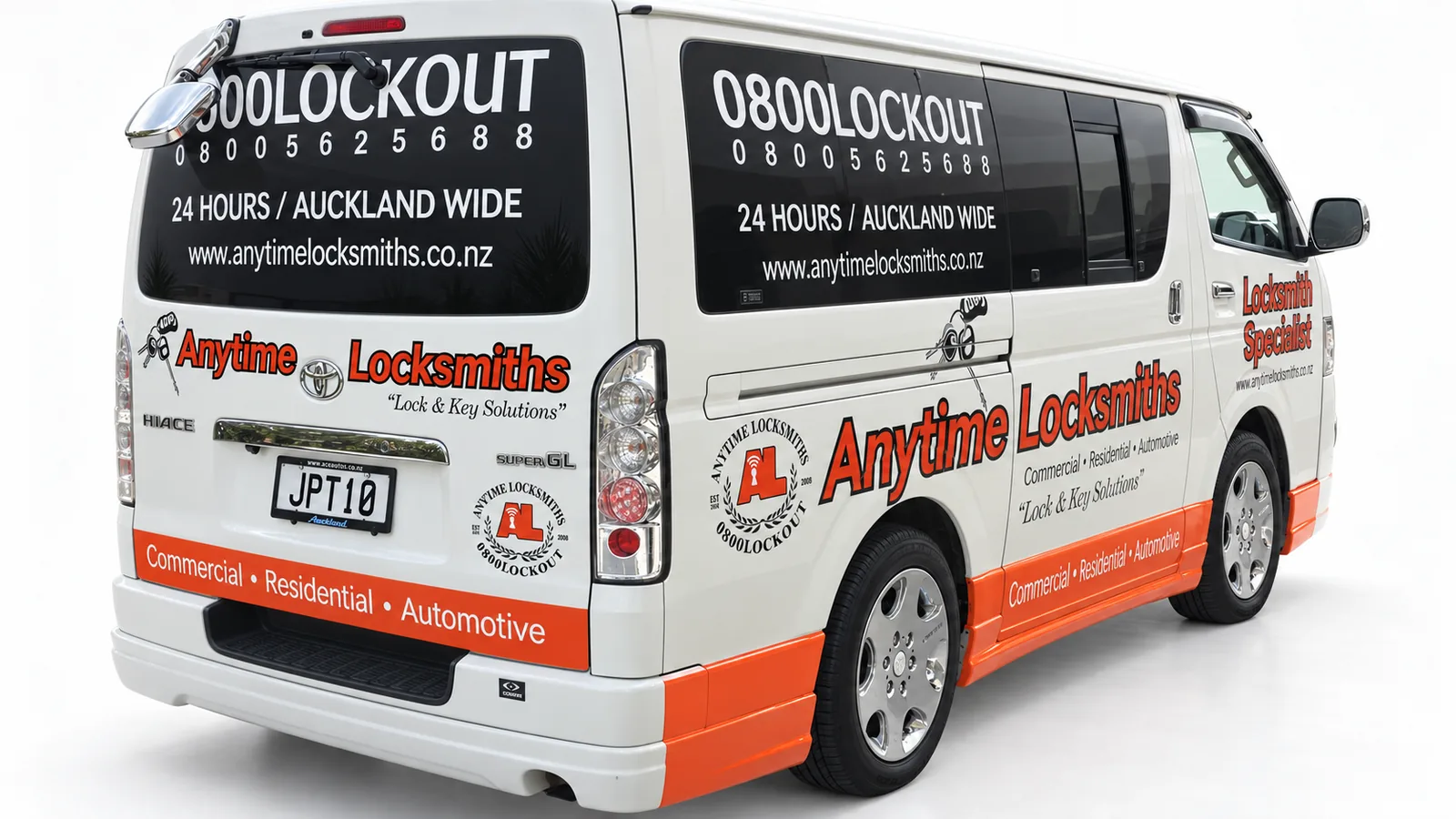
Bold red lettering, black information panels and an orange lower stripe give this locksmith van a clear visual structure. The business name leads the design, with service information and contact details arranged around the side and rear views.
Anytime Locksmiths van signage with a bold front-to-side identity.Rear and side graphics connect the locksmith identity with contact information.
Large tyre imagery and a blue, white and navy colour palette connect this van directly to the Everest Tyre Wholesale NZ identity. The side composition combines a prominent wordmark with product imagery, while the lower information strip keeps secondary details together.
Blue colour blocking and tyre imagery give Everest a distinctive van design.A large side wordmark leads the Everest vehicle-signage composition.
Get Fresh truck signage brings food photography, bold headings and a structured panel layout together on a large commercial vehicle. The side displays a range of food imagery beneath the brand name, while the rear gives takeaway messaging its own composition.
Food photography connects Get Fresh branding with takeaway messaging.The truck body becomes a structured full-colour food display.
CFR Line: a portable display for vehicle and caravan shipping
1 image
For shipping and logistics services, photographs can help explain the goods being moved. CFR Line combines vehicle imagery with a concise shipping headline in a freestanding display.
Ray White: customer-facing signage and interior workplace lettering
1 image
Real-estate offices need a recognisable public entrance and a considered working environment. This collection includes customer-facing signage and an interior typography example identified as Ray White Ormiston.
Green, red and black graphics give this JCP Japanese Car Parts van a bold, coordinated identity. Diagonal colour fields connect the side panels with the rear, while the large JCP mark remains separate from supporting automotive-brand details and contact information.
JCP’s rear layout separates the brand, automotive details and contact information.Large diagonal panels give the JCP van a strong graphic direction.The alternate angle shows the JCP identity carried across side and rear panels.
Copier Service Company: coordinated showroom and workshop entrance graphics
3 images
Office-equipment businesses may have separate customer and service entrances. This project shows how consistent glazing graphics can identify both the company and the purpose of each door.
Copier Service Company showroom glazing.Copier Service Company angled entrance view.Copier Service Company workshop entrance.
ST hi-tec: matching exterior and interior signs for a tuning business
1 image
Automotive specialists can carry the same identity from the workshop exterior to reception. ST hi-tec uses coordinated dark panels and a prominent red-and-silver mark in both settings.
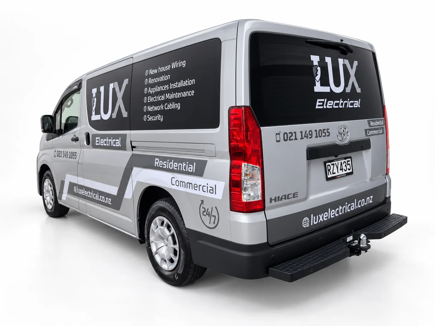
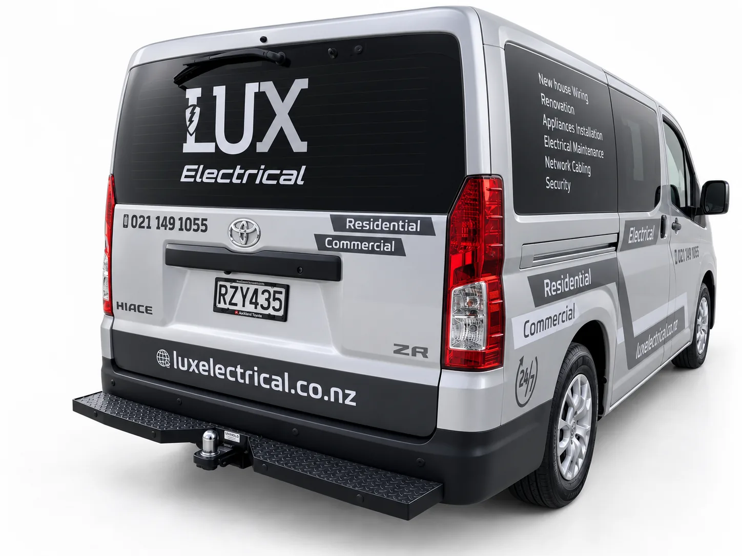
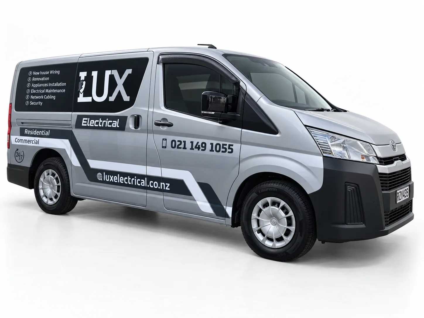
A professional identity applied across vehicles, signage, apparel and print for LUX Electrical, developed when Jason established the commercial electrical business.
Charcoal logo panels and grey geometry complement the silver LUX van.A large rear logo anchors the LUX Electrical vehicle design.A restrained palette gives this electrical-service van a coordinated appearance.
Dannemora Al-Falaah Centre: clear parking messages in a portable format
2 images
Community venues need clear arrival information during busy gatherings. These matching A-boards separate parking directions from a parking-full instruction through colour, symbols and large type.
Unique Hair & Beauty: a complete salon signage collection, outside and in
1 image
Connecting a recessed salon’s roadside presence with its frontage and reception, Unique Hair & Beauty uses each sign and graphic for a distinct part of the customer approach.
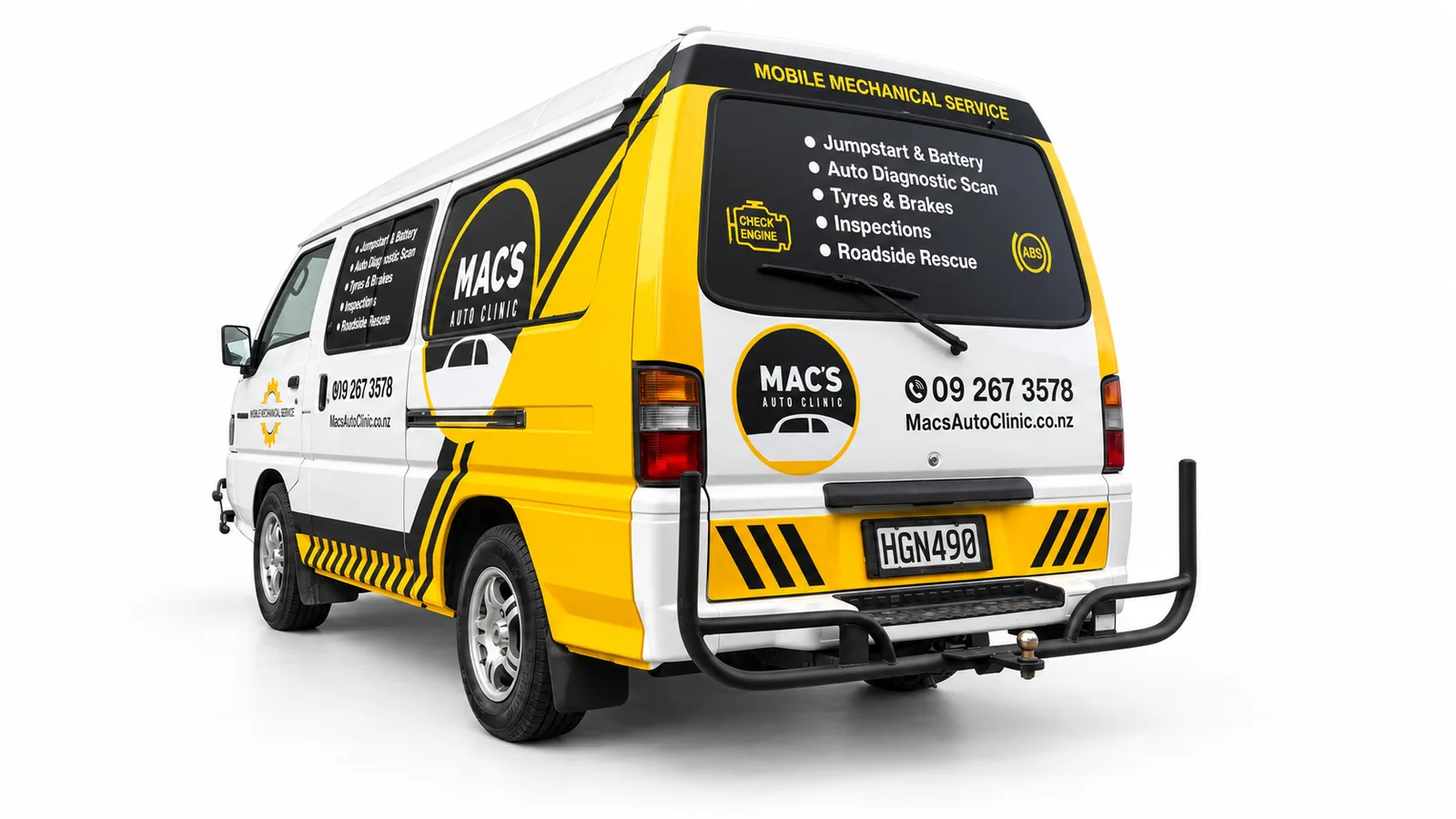
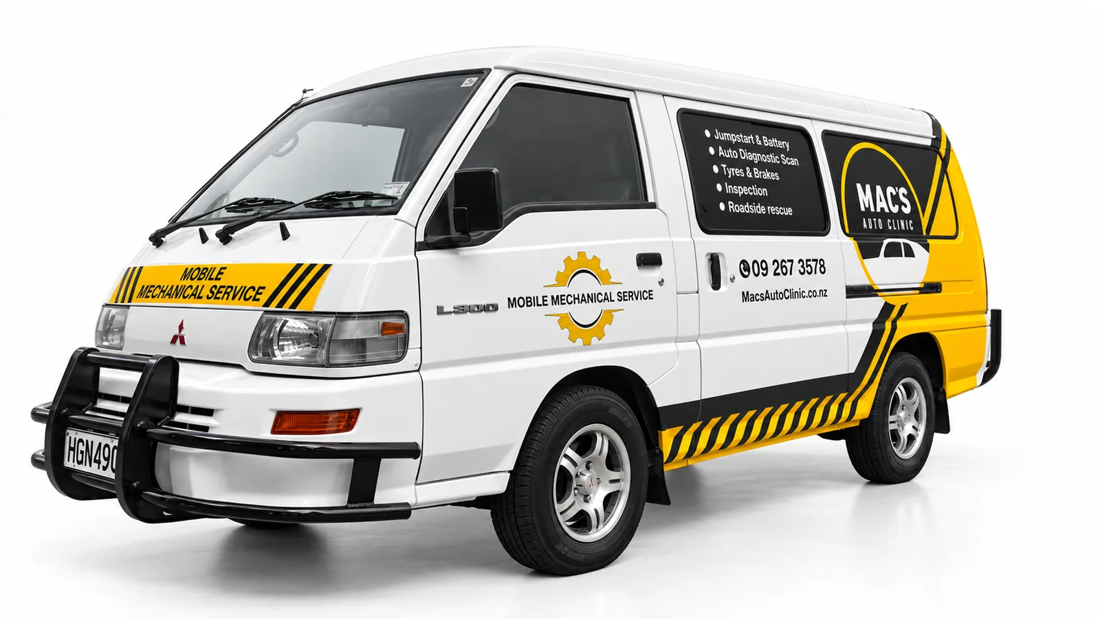
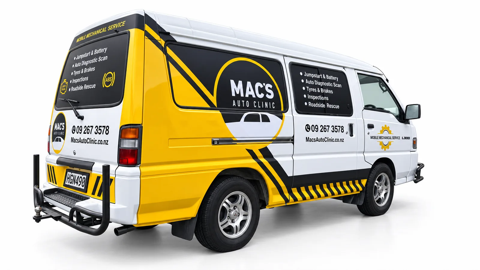
Yellow panels, black graphics and white space give the Mac’s Auto Clinic mobile-service van an automotive character. Circular logo areas are supported by service lists and contact details, while diagonal stripes connect the lower body and rear.
Yellow panels and black lettering connect the mobile-mechanic message.Mobile-mechanic van signage built around yellow, black and white contrast.The side composition balances a large logo with a separate service panel.
Drive Smart: a mobile advertising display for training services
2 images
Training providers can use trailer displays to present courses beyond a fixed shopfront. Drive Smart’s signage adapts the message across broad side panels and narrower end panels.
Drive Smart training trailer display.Drive Smart trailer end and side graphics.
Zoyz Auto Services: exterior visibility connected to a reception identity
1 image
Automotive premises need a clear arrival marker and recognisable reception. Zoyz combines a service-led exterior sign with a simpler interior logo panel.
These Post Haste vehicle-signage examples show a monochrome identity adapted to different van proportions. A large fern motif provides the principal graphic, with the courier name positioned on the side and rear. SignSpot’s Auckland scope covered signage design and layout, print, supply, installation and coordination.
A sweeping fern graphic gives the Post Haste van a recognisable side profile.Courier branding adapted to a compact van’s proportions.The rear branding complements the larger fern graphic along the side.
Imperial College: coordinated signage from parking to reception
2 images
Connecting education branding with parking, directories and reception, Imperial College’s signage applies one visual identity to recognition and practical visitor wayfinding.
Imperial College exterior identification.Imperial College parking signs.
Chambers Consultants: directory graphics that separate identity and directions
1 image
Engineering and professional offices often share a building with other tenants. Chambers’ directory shows how logo placement, separate rows and clear arrows can organise an office arrival point.
A consistent identity across different vehicles and business touchpoints for the RAMS Group of Companies, covering Auckland and Wellington fleet applications, office entrance graphics and a pull-up banner.
Blue and grey graphics connect the RAMS identity across an SUV.A larger body panel gives RAMS waste-management messaging a clear position.A shared graphic system connects a service van and waste-management truck.Different vehicle proportions carry the same RAMS visual identity.The alternate SUV angle shows the fleet graphics following the body shape.The RAMS service message continues from the side panel onto the rear doors.An opposite-side view shows the repeated branding around the RAMS van.A broad side panel gives the RAMS stripes room to establish the identity.RAMS fleet branding continues across rear and side viewing angles.A vertical rear layout organises the RAMS identity and service details.The rear-quarter view links the RAMS rear layout with its diagonal side motif.A longer side view shows the RAMS graphic system across doors and rear panels.
Indus Legal: a consistent identity from exterior glazing to reception
1 image
Connecting exterior recognition with a clearly branded upstairs reception, Indus Legal uses coordinated window, entrance and reception identification along the visitor route.
Femme Advanced Skin Clinic: an illuminated interior identity
1 image
Skin and beauty clinics can use illuminated interior signs as a brand focal point. Femme pairs a restrained logo panel with a warm halo and clearly separated business descriptor.
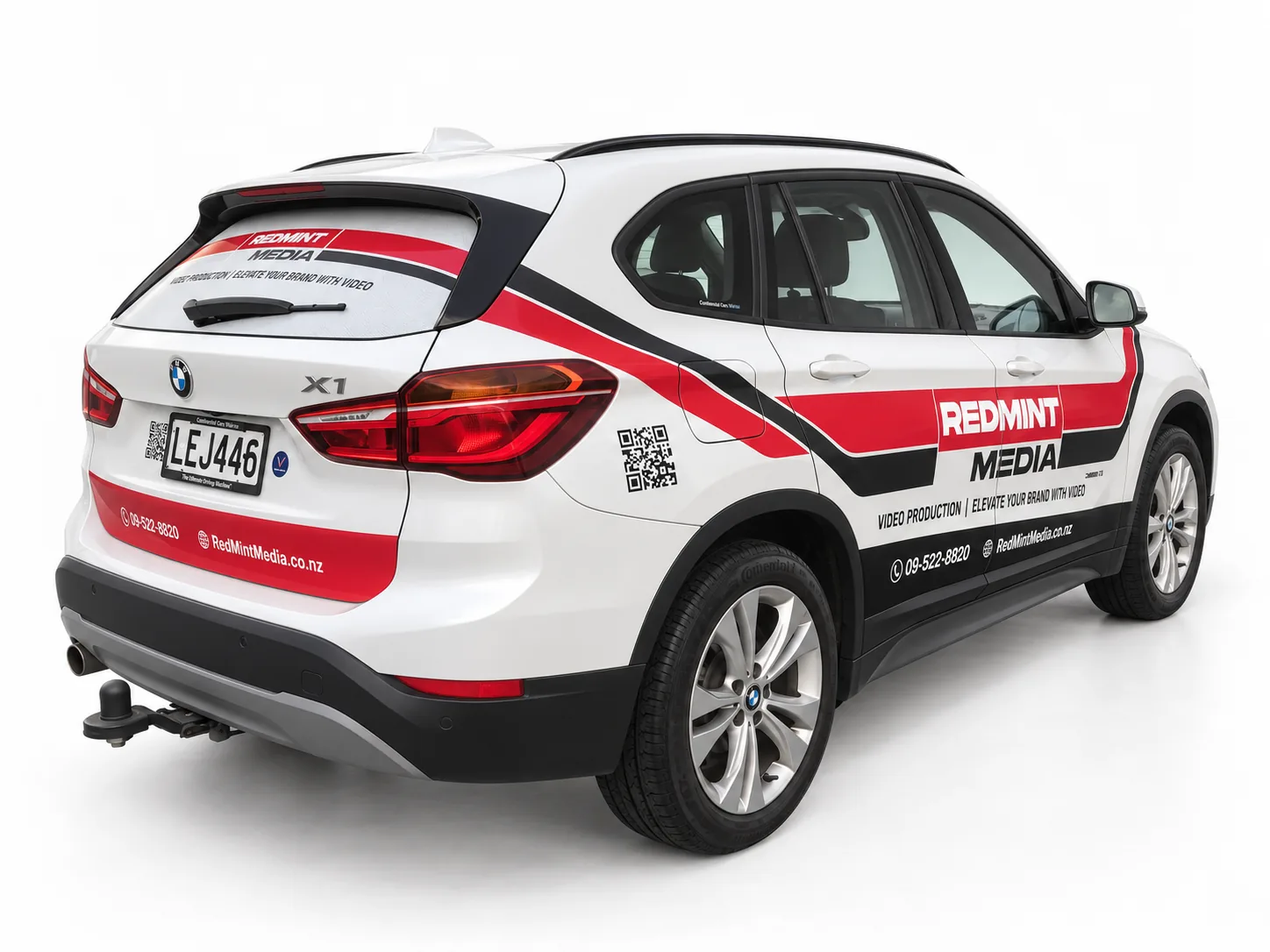
Redmint Media’s white BMW SUV carries a red and black graphic system that follows the bonnet, doors and rear bodywork. A strong wordmark, angular bands and separate contact areas give the design a clear visual rhythm.
A red-and-black bonnet graphic introduces the Redmint Media identity.Angular red-and-black bands connect the Redmint Media side and rear design.The alternate angle shows the Redmint Media graphics following the rear body lines.
Jan Japan Motors: a complete visual treatment for the sales-office frontage
1 image
Car-yard offices need to be recognisable within the wider sales environment. Jan Japan Motors combines fascia lettering, a large wall graphic and entrance identification in one frontage treatment.
Maia Ink: large wall graphics that give the interior a distinct identity
1 image
Body-art businesses can use interior graphics to establish a distinctive visual identity. Maia Ink combines a large patterned wall treatment with a separate, prominent brand display.
Right First Driving School car signage combines large black lettering, yellow checkerboard graphics and red identity panels on a white hatchback. The teaching purpose is prominent on the side and rear, while smaller contact details sit in their own areas.
Large driving-school lettering is supported by yellow checkerboard graphics.The driving-school message continues across the hatch and side panels.
PAK’nSAVE: a bold community sponsorship sign for netball
1 image
Retail sponsors can use venue signage to acknowledge a community relationship. This PAK’nSAVE panel combines brand recognition with a prominent netball-club sponsorship message.
Marhaba: dimensional lettering as an interior brand focal point
1 image
Food brands can establish a memorable interior focal point with dimensional lettering. Marhaba uses bright colour, scale and open wall space to emphasise its name.
Vehicle signs · SVS Panel & Paint / MAS Mechanical
Ute Signage Auckland — SVS & MAS
3 images
SVS Panel & Paint and MAS Mechanical share a red, black and white signage scheme on this Ford Ranger Raptor. Large door and rear logos give each business its own position, while red diagonal graphics connect the two identities across the ute.
Two automotive identities share a coordinated red-and-black ute design.Large door branding anchors the dual-brand ute signage.The tailgate gives both automotive brands a balanced rear-facing position.
Pro Active Traffic Management: a coordinated set of site and arrival signs
5 images
Civil and traffic-management businesses need clear premises identification as well as operational signs. This collection separates entrance, office and staff-parking messages within one consistent design.
Pro Active staff-parking direction.Pro Active approach sign.Pro Active welcome sign.Pro Active office sign.Pro Active fence branding.
Interior signs · New Zealand School of Vocational Education and Training
Vocational education reception signage with a clear, consistent identity
1 image
Education reception areas need clear institutional identification. This project pairs a wall-mounted sign with coordinated desk graphics for the New Zealand School of Vocational Education and Training.
This South Auckland Muslim Association funeral-service van uses a restrained black-and-white layout suited to its purpose. Large service lettering is combined with checkerboard details, organisation identification and religious text on the rear glazing. SignSpot delivered design, print, supply, installation and coordination in Auckland.
A restrained monochrome layout identifies the funeral-service vehicle.Large service lettering provides the central message along the van’s side.Rear signage separates religious text, organisation identity and service wording.The front-quarter view connects the bonnet message with the side identification.
RAMS: entrance glazing that carries a clear service identity
1 image
Cleaning and property-maintenance companies can extend fleet branding into their premises. RAMS uses blue-and-white entrance graphics to connect business identification, services and contact information.
New Zealand Fiji Football: a repeat-logo backdrop for event presentation
1 image
Sports organisations can use a repeat-logo backdrop to maintain identity across event photographs. This New Zealand Fiji Football display uses a regular emblem pattern on a clean white background.
Introducing a new business through coordinated truck and van branding, with the logo, typography and colour system adapted to different panel sizes while remaining consistent.
Rear-ramp panels extend the Move Sharpe identity across a transporter truck.A broad tipper panel gives earthworks and plant-hire lettering prominence.A studio-style fleet presentation shows the identity across trucks and supporting vehicles.The alternate rear angle highlights the relationship between ramp and cab-back graphics.The tipper identity is distributed across a long side panel and compact rear panels.Two commercial trucks share the Move Sharpe colour and lettering system.The transporter cab carries the core Move Sharpe identity and service message.The opposite angle shows the commercial-truck graphics arranged around the cab.
Ray White: customer-facing signage and interior workplace lettering
1 image
Real-estate offices need a recognisable public entrance and a considered working environment. This collection includes customer-facing signage and an interior typography example identified as Ray White Ormiston.
Vesta Electrical Suppliers van signage uses orange and charcoal graphics to establish a coordinated identity across the side and rear. Framed logo panels carry the main branding, with a horizontal orange band connecting the website and supporting details.
Orange-and-charcoal branding gives Vesta a defined rear identity panel.A horizontal orange band connects the rear and side signage.Selected panels carry the Vesta identity without covering the entire van.
ST hi-tec: matching exterior and interior signs for a tuning business
1 image
Automotive specialists can carry the same identity from the workshop exterior to reception. ST hi-tec uses coordinated dark panels and a prominent red-and-silver mark in both settings.
Wipeout Pest Control’s compact van uses black lettering and bright green accents against a white body. The large wordmark anchors the side panels, while phone, service and digital-contact information are grouped into separate strips. SignSpot handled signage design, print, supply, installation and coordination in Auckland.
Bright green information strips support a large black Wipeout wordmark.The opposite view shows the Wipeout identity repeated across side and rear.
Solmech New Zealand: large-scale branding across a shipping container
1 image
Containers offer a large surface for industrial business identification. Solmech’s design uses scale and contrast to place the company name across the corrugated side.
Super Cheap Tyres: coordinated fascia signage across a busy workshop
2 images
Tyre and automotive workshops may need to present several services together. This red fascia scheme connects the premises while separating the main brand and supporting service panels.
Super Cheap Tyres fascia detail.Super Cheap Tyres workshop frontage.
Unique Hair & Beauty: a complete salon signage collection, outside and in
5 images
Connecting a recessed salon’s roadside presence with its frontage and reception, Unique Hair & Beauty uses each sign and graphic for a distinct part of the customer approach.
Zoyz Auto Services: exterior visibility connected to a reception identity
1 image
Automotive premises need a clear arrival marker and recognisable reception. Zoyz combines a service-led exterior sign with a simpler interior logo panel.