Browse every approved vehicle-signage photograph by client. Open any image to continue through the complete vehicle gallery.
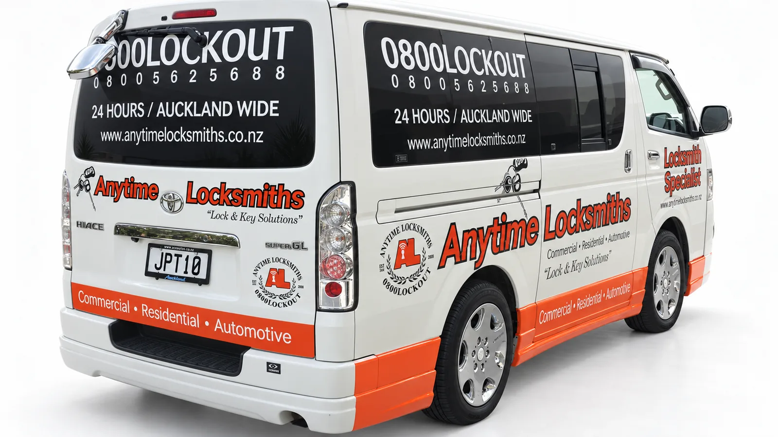
Anytime Locksmiths
Locksmith Van Signage Auckland — Anytime Locksmiths
2 photos
Bold red lettering, black information panels and an orange lower stripe give this locksmith van a clear visual structure. The business name leads the design, with service information and contact details arranged around the side and rear views. SignSpot delivered the Auckland vehicle-signage project from design and print through to supply, installation and coordination. The result demonstrates a practical approach to work-van branding: strong identity, deliberate contrast and information grouped by importance.
Anytime Locksmiths van signage with a bold front-to-side identity.Rear and side graphics connect the locksmith identity with contact information.
Large tyre imagery and a blue, white and navy colour palette connect this van directly to the Everest Tyre Wholesale NZ identity. The side composition combines a prominent wordmark with product imagery, while the lower information strip keeps secondary details together. SignSpot handled the design, printed graphics, supply and installation in Auckland. This vehicle-branding project shows how a business can use illustration scale and contrasting colour areas to give a working van a distinctive presence.
Blue colour blocking and tyre imagery give Everest a distinctive van design.A large side wordmark leads the Everest vehicle-signage composition.
Get Fresh truck signage brings food photography, bold headings and a structured panel layout together on a large commercial vehicle. The side displays a range of food imagery beneath the brand name, while the rear gives takeaway messaging its own composition. SignSpot delivered design, print, supply, installation and coordination in Auckland. The design focus is the relationship between brand recognition and product presentation, using the box body as a generous canvas for full-colour graphics.
Food photography connects Get Fresh branding with takeaway messaging.The truck body becomes a structured full-colour food display.
Green, red and black graphics give this JCP Japanese Car Parts van a bold, coordinated identity. Diagonal colour fields connect the side panels with the rear, while the large JCP mark remains separate from supporting automotive-brand details and contact information. SignSpot delivered the vehicle-signage design and application project in Auckland, including digital print, supply, installation and coordination. The composition demonstrates how a detailed business message can be organised into clear visual levels across a high-roof van.
JCP’s rear layout separates the brand, automotive details and contact information.Large diagonal panels give the JCP van a strong graphic direction.The alternate angle shows the JCP identity carried across side and rear panels.
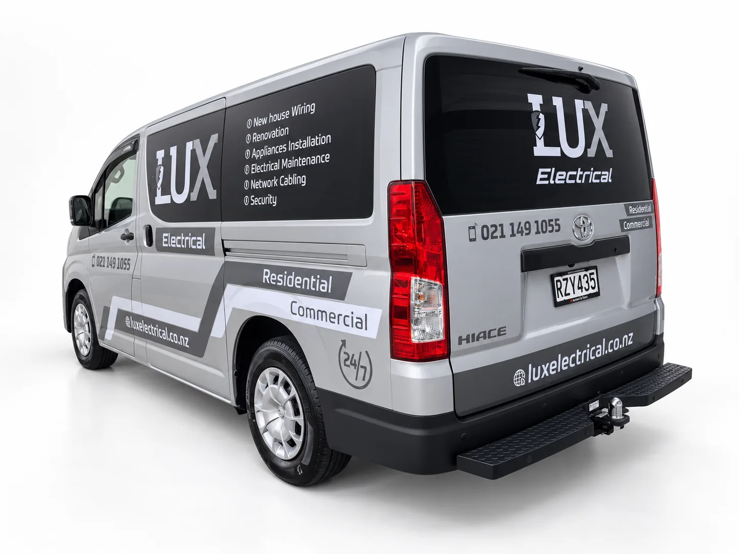
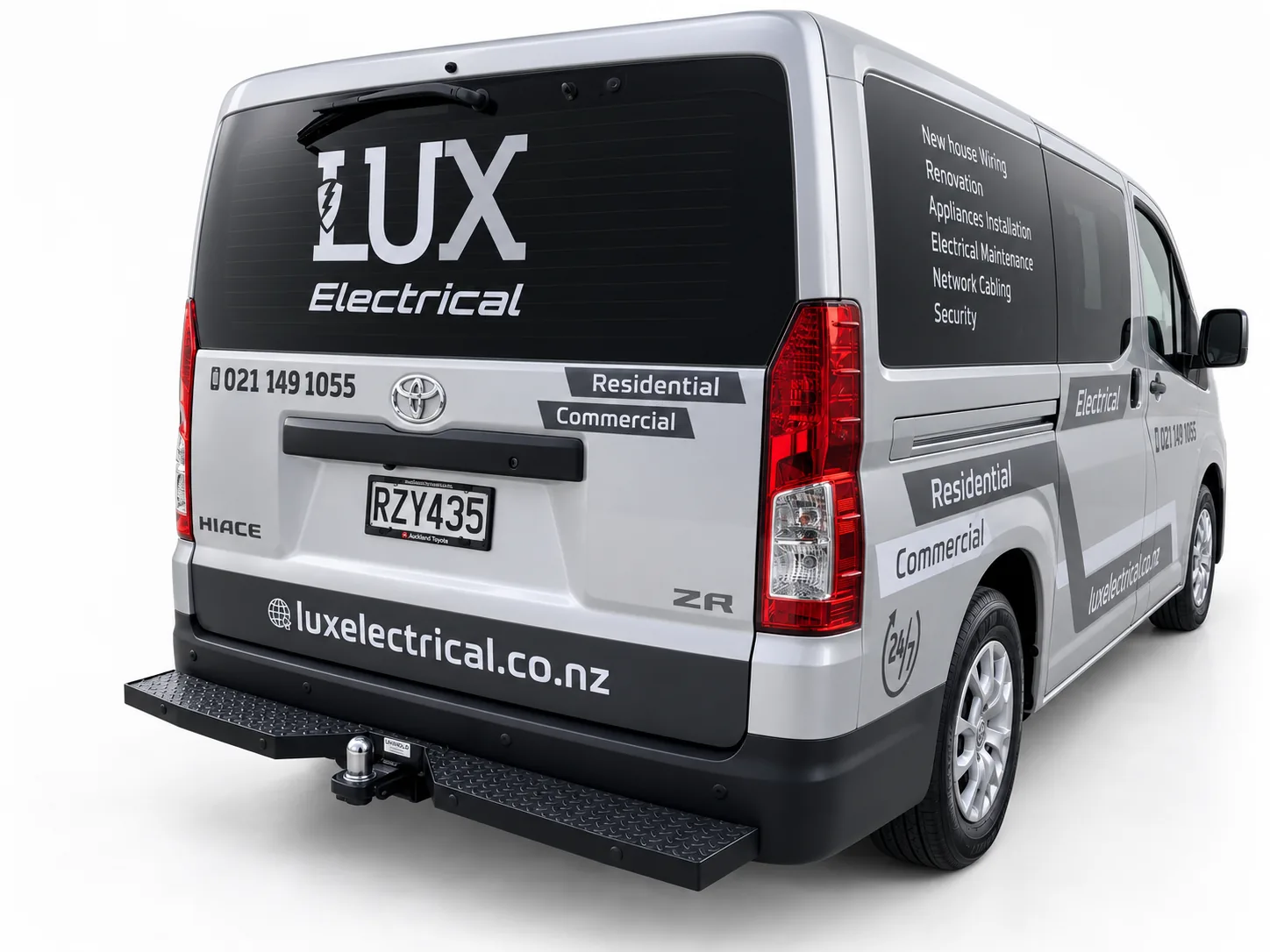
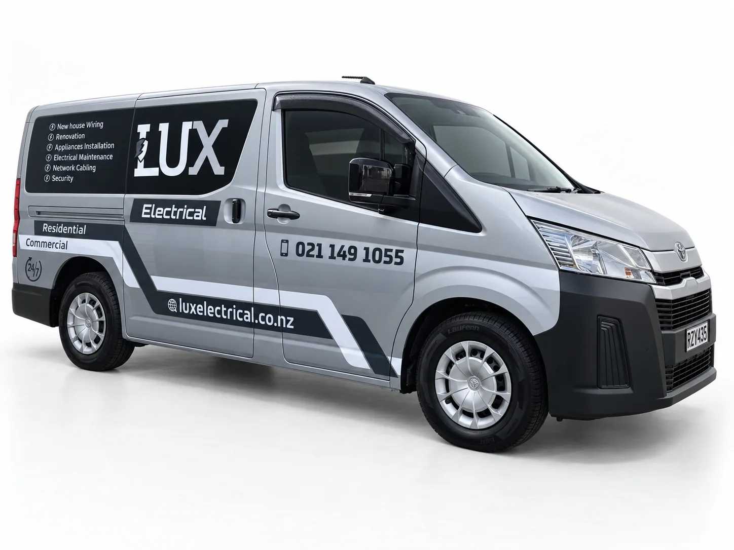
A professional identity applied across vehicles, signage, apparel and print for LUX Electrical, developed when Jason established the commercial electrical business.
Charcoal logo panels and grey geometry complement the silver LUX van.A large rear logo anchors the LUX Electrical vehicle design.A restrained palette gives this electrical-service van a coordinated appearance.
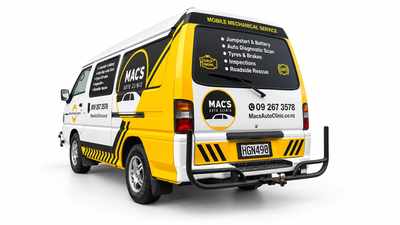
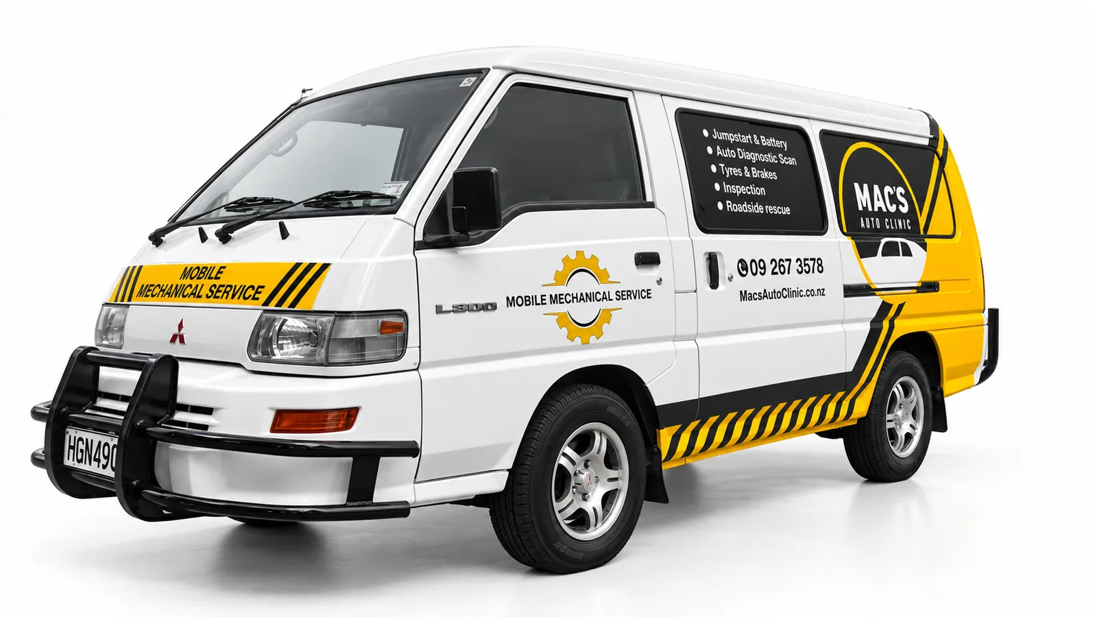
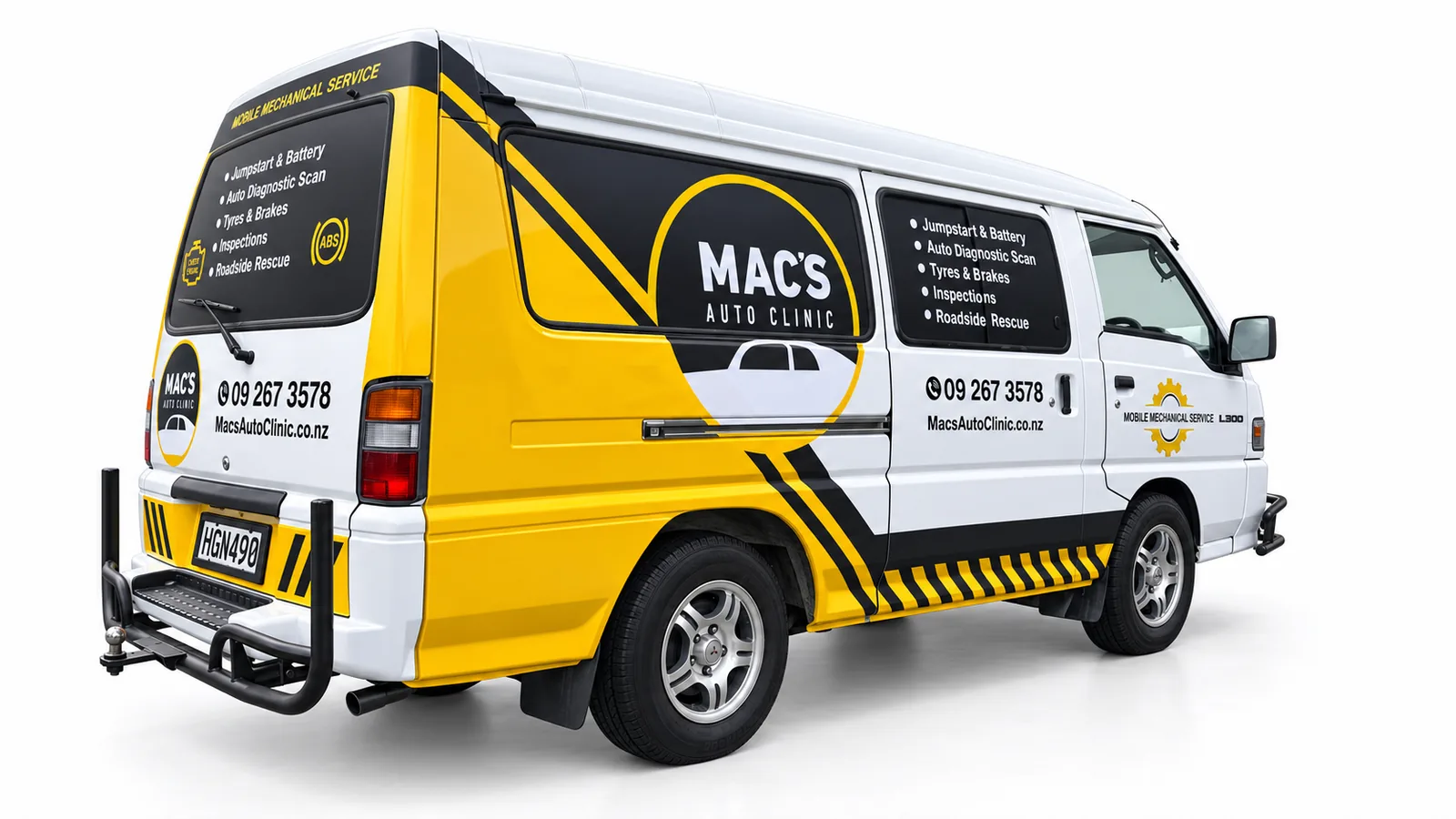
Yellow panels, black graphics and white space give the Mac’s Auto Clinic mobile-service van an automotive character. Circular logo areas are supported by service lists and contact details, while diagonal stripes connect the lower body and rear. SignSpot delivered the Auckland signage design, print, supply and installation project with coordination throughout. The design makes the vehicle’s service purpose central to the composition, using a strong contrast between the branded yellow areas and the original white body.
Yellow panels and black lettering connect the mobile-mechanic message.Mobile-mechanic van signage built around yellow, black and white contrast.The side composition balances a large logo with a separate service panel.
These Post Haste vehicle-signage examples show a monochrome identity adapted to different van proportions. A large fern motif provides the principal graphic, with the courier name positioned on the side and rear. SignSpot’s Auckland scope covered signage design and layout, print, supply, installation and coordination. The work demonstrates vehicle-specific brand application: preserving a recognisable visual identity while arranging the graphics around each van’s glazing, doors and body shape.
A sweeping fern graphic gives the Post Haste van a recognisable side profile.Courier branding adapted to a compact van’s proportions.The rear branding complements the larger fern graphic along the side.
A consistent identity across different vehicles and business touchpoints for the RAMS Group of Companies, covering Auckland and Wellington fleet applications, office entrance graphics and a pull-up banner.
Blue and grey graphics connect the RAMS identity across an SUV.A larger body panel gives RAMS waste-management messaging a clear position.A shared graphic system connects a service van and waste-management truck.Different vehicle proportions carry the same RAMS visual identity.The alternate SUV angle shows the fleet graphics following the body shape.The RAMS service message continues from the side panel onto the rear doors.An opposite-side view shows the repeated branding around the RAMS van.A broad side panel gives the RAMS stripes room to establish the identity.RAMS fleet branding continues across rear and side viewing angles.A vertical rear layout organises the RAMS identity and service details.The rear-quarter view links the RAMS rear layout with its diagonal side motif.A longer side view shows the RAMS graphic system across doors and rear panels.
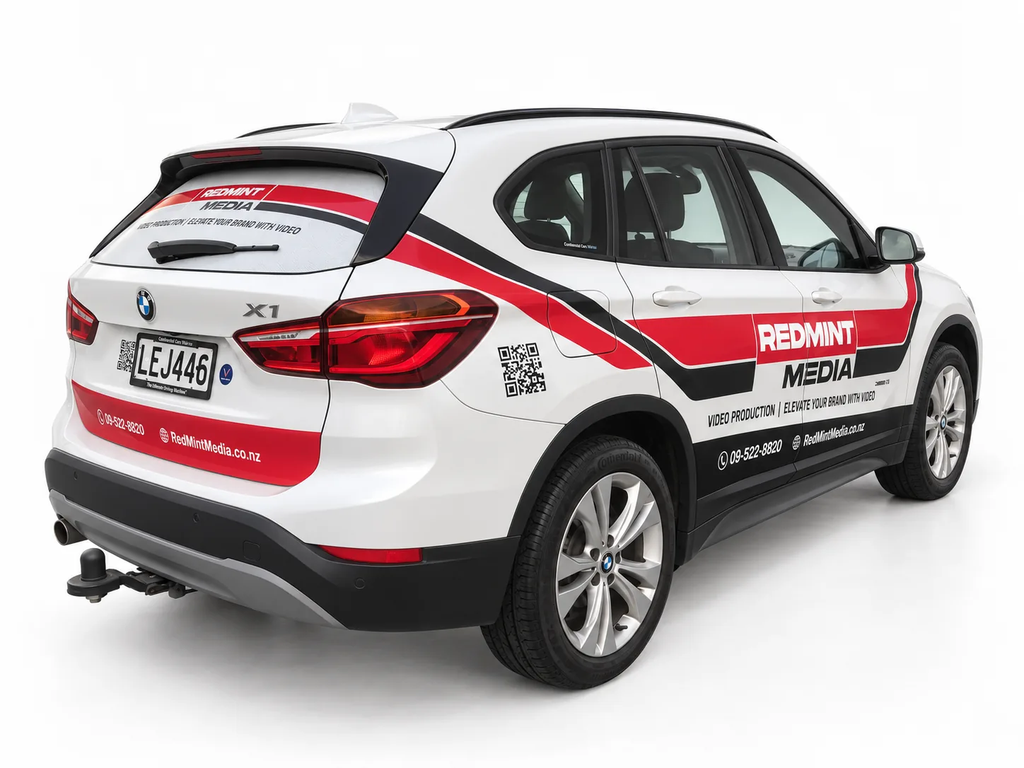
Redmint Media’s white BMW SUV carries a red and black graphic system that follows the bonnet, doors and rear bodywork. A strong wordmark, angular bands and separate contact areas give the design a clear visual rhythm. SignSpot delivered signage design, print, supply, installation and coordination for this Auckland project. The composition balances expressive branding with the vehicle’s existing shape, showing how selected graphic coverage can create a distinctive business vehicle without covering every panel.
A red-and-black bonnet graphic introduces the Redmint Media identity.Angular red-and-black bands connect the Redmint Media side and rear design.The alternate angle shows the Redmint Media graphics following the rear body lines.
Right First Driving School car signage combines large black lettering, yellow checkerboard graphics and red identity panels on a white hatchback. The teaching purpose is prominent on the side and rear, while smaller contact details sit in their own areas. SignSpot handled the design, print, supply, installation and coordination in Auckland. The visual approach gives the driving-school message priority and uses repeated colours to connect the bonnet, doors and rear of the vehicle.
Large driving-school lettering is supported by yellow checkerboard graphics.The driving-school message continues across the hatch and side panels.
SVS Panel & Paint and MAS Mechanical share a red, black and white signage scheme on this Ford Ranger Raptor. Large door and rear logos give each business its own position, while red diagonal graphics connect the two identities across the ute. SignSpot delivered the Auckland design, print, supply, installation and coordination project. The design uses the black vehicle body as part of the composition, balancing substantial branding with clearly separated information and supporting graphics.
Two automotive identities share a coordinated red-and-black ute design.Large door branding anchors the dual-brand ute signage.The tailgate gives both automotive brands a balanced rear-facing position.
This South Auckland Muslim Association funeral-service van uses a restrained black-and-white layout suited to its purpose. Large service lettering is combined with checkerboard details, organisation identification and religious text on the rear glazing. SignSpot delivered design, print, supply, installation and coordination in Auckland. The visual emphasis is respectful identification and considered placement, allowing the service name to remain prominent while supporting information is arranged around the van’s existing windows and panels.
A restrained monochrome layout identifies the funeral-service vehicle.Large service lettering provides the central message along the van’s side.Rear signage separates religious text, organisation identity and service wording.The front-quarter view connects the bonnet message with the side identification.
Introducing a new business through coordinated truck and van branding, with the logo, typography and colour system adapted to different panel sizes while remaining consistent.
Rear-ramp panels extend the Move Sharpe identity across a transporter truck.A broad tipper panel gives earthworks and plant-hire lettering prominence.A studio-style fleet presentation shows the identity across trucks and supporting vehicles.The alternate rear angle highlights the relationship between ramp and cab-back graphics.The tipper identity is distributed across a long side panel and compact rear panels.Two commercial trucks share the Move Sharpe colour and lettering system.The transporter cab carries the core Move Sharpe identity and service message.The opposite angle shows the commercial-truck graphics arranged around the cab.
Vesta Electrical Suppliers van signage uses orange and charcoal graphics to establish a coordinated identity across the side and rear. Framed logo panels carry the main branding, with a horizontal orange band connecting the website and supporting details. SignSpot delivered the design, print, supply, installation and coordination project in Auckland. The design follows the van’s existing body lines and uses selected areas of colour to create a clear business presentation around the windows and doors.
Orange-and-charcoal branding gives Vesta a defined rear identity panel.A horizontal orange band connects the rear and side signage.Selected panels carry the Vesta identity without covering the entire van.
Wipeout Pest Control’s compact van uses black lettering and bright green accents against a white body. The large wordmark anchors the side panels, while phone, service and digital-contact information are grouped into separate strips. SignSpot handled signage design, print, supply, installation and coordination in Auckland. The composition demonstrates how a smaller commercial vehicle can carry a substantial business message through scale, contrast and a disciplined separation of primary branding from secondary information.
Bright green information strips support a large black Wipeout wordmark.The opposite view shows the Wipeout identity repeated across side and rear.
The right option depends on viewing distance, body shape, paint condition, budget and how long the graphics need to remain in place.
Spot graphics
Business name, logo and key contact details on selected panels. A practical choice for clear identification.
Partial wrap
Printed and cut graphics across selected body areas for more visual impact without covering every painted panel.
Full wrap
Extensive printed coverage for a major visual change. Vehicle condition, joins and removal expectations need to be assessed first.
Fleet programme
A repeatable layout, colour approach and installation record for multiple vehicles and future additions.
Magnetic signs, where supplied
A removable option for suitable clean, flat ferrous-steel panels. They are not suitable for aluminium, composite or strongly curved panels and must be removed and cleaned regularly to avoid trapped dirt or moisture.
BEFORE PRODUCTION
What affects design, downtime and durability
Vector logos and brand colours give the clearest artwork starting point. Vehicle templates guide layout, but photographs and an inspection help confirm handles, mouldings, damage, previous graphics and usable panel areas. Preparation and installation time depends on coverage, vehicle condition and quantity.
Vehicle make, model, year and photographsPaint and existing-graphic conditionArtwork quality and required wordingSingle vehicle or repeatable fleet layoutExpected service life and removal needsAccess and preferred installation timing
CARE & REMOVAL
Plan for the full life of the graphics
Cleaning method, sun exposure, panel damage and later removal all affect the result. Existing graphics and paint condition should be assessed before replacement; removal can reveal colour differences, adhesive or underlying damage. SignSpot confirms the chosen film system and care guidance with the project specification.
The quote depends on coverage, vehicle size and shape, artwork, existing graphics and paint condition. Send photographs of each side, the make and model, your logo and the number of vehicles. We can then identify the information needed to price your chosen coverage.
How long will my vehicle be off the road?
Timing is agreed after the coverage, preparation and vehicle availability are known. Tell us when the vehicle is needed for work so the installation plan can account for it.
Can you work from my existing logo?
Send the best logo file you have, ideally vector artwork, together with your wording and brand colours. We will check its suitability and agree any artwork preparation before production.
EAST TĀMAKI · AUCKLAND
Plan signage for your working vehicle
SignSpot is based in East Tāmaki and works with Auckland businesses. Share your vehicle details and availability so we can confirm the scope and installation arrangements.